Client: Magnetic Magazine – an online, international music and culture magazine based in Denver, USA.
Objective: Develop a concept for a printed version of the magazine to be distributed for free at global events such as music festivals and art shows. The printed version should curate trending content from their website, have a long shelf-life, and provide a calm, artistic space away from digital noise.
The task
The task was made up of several components:
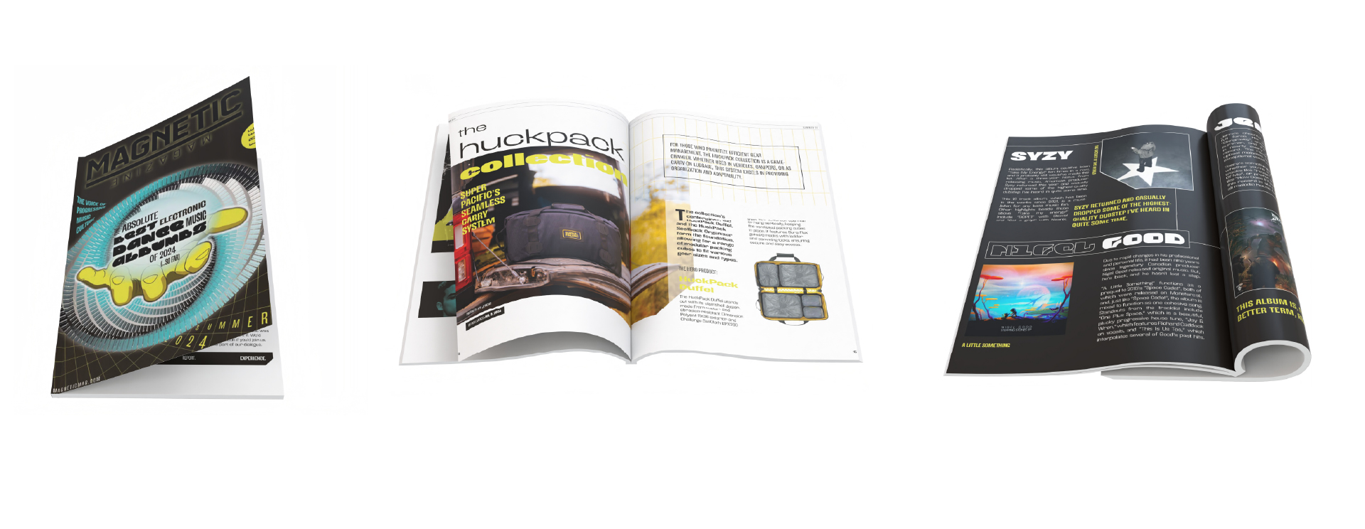
Magazine cover featuring unique original artwork (that will also serve as the artwork for one article)
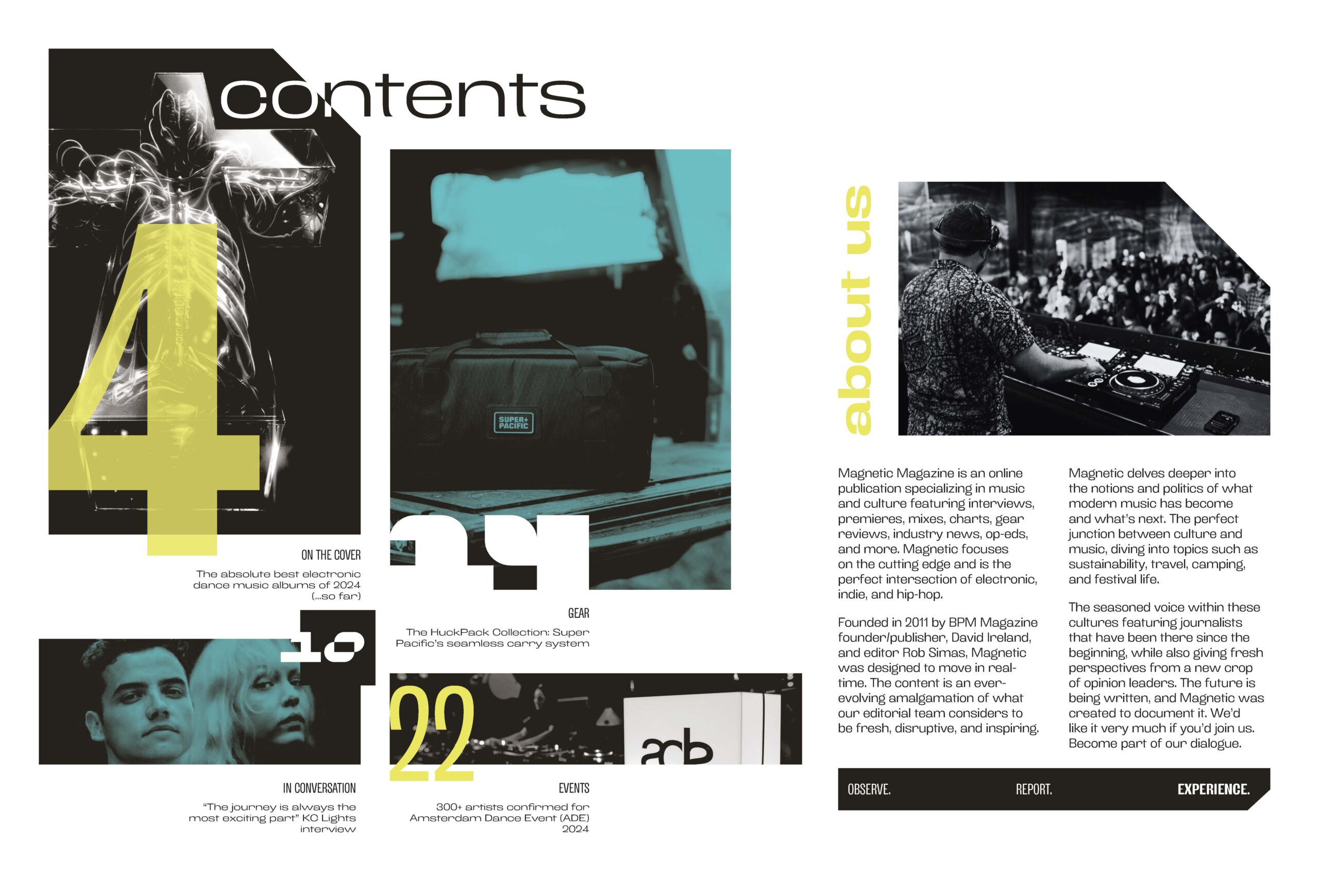
Contents spread
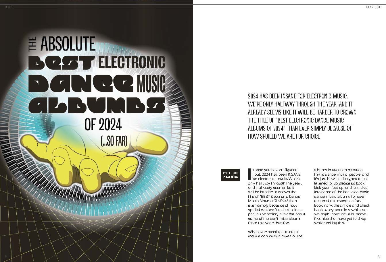
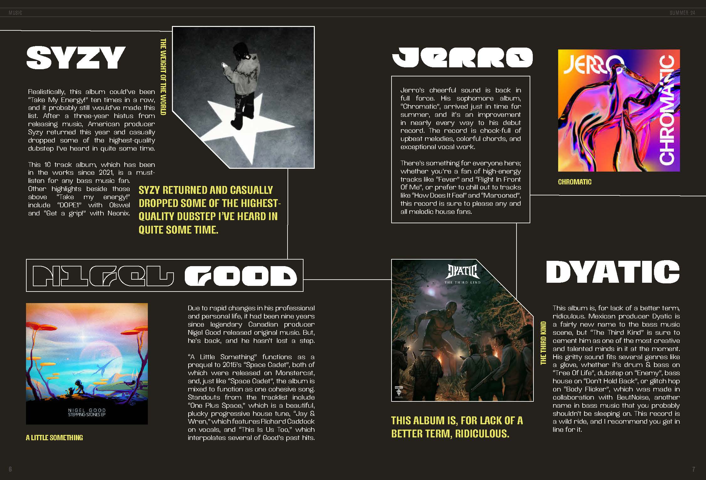
Design and layout of four articles from different content areas
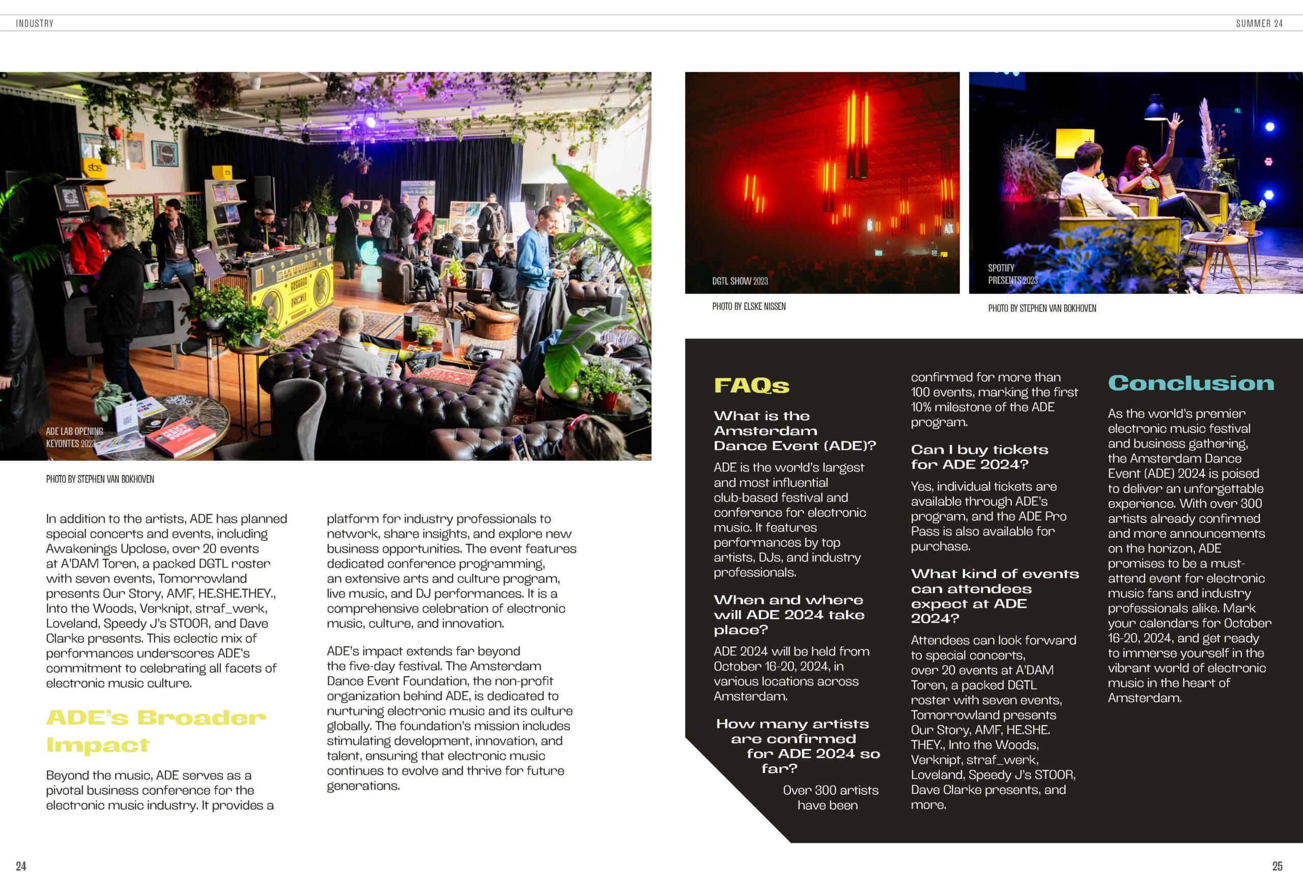
Consistency of design style was important across all elements. I created this through implementing a grid and layout style; defining hierarchy for title, byline, introduction, subheadings, body text, captions and pagination; and consistency through image style whether photography or illustration.
Design
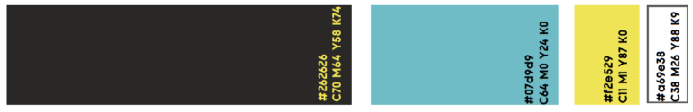
Colours
Based on research into the electronic music market, I discerned a colour palette with high-contrast. This palette was versatile, allowing for both light and dark backgrounds, as well as complementing the images in the articles.
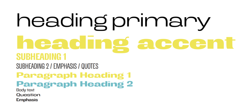
Typography
I chose a variable typeface called Antipoda. It is sans serif, highly legible and had an approachable, characterful feeling, perfect for the tone of Magnetic Magazine’s articles. It had both condensed and extended versions in many different weights which gave me flexibility.
I created a typographic hierarchy based on the content of the articles I had selected. I deliberately used several different fonts within Antipoda and styled them contrastingly as I wanted the typography to create texture and interest throughout the design.
Graphic elements
I created a set of visual motifs that would appear throughout the magazine spreads creating consistency, texture and character:
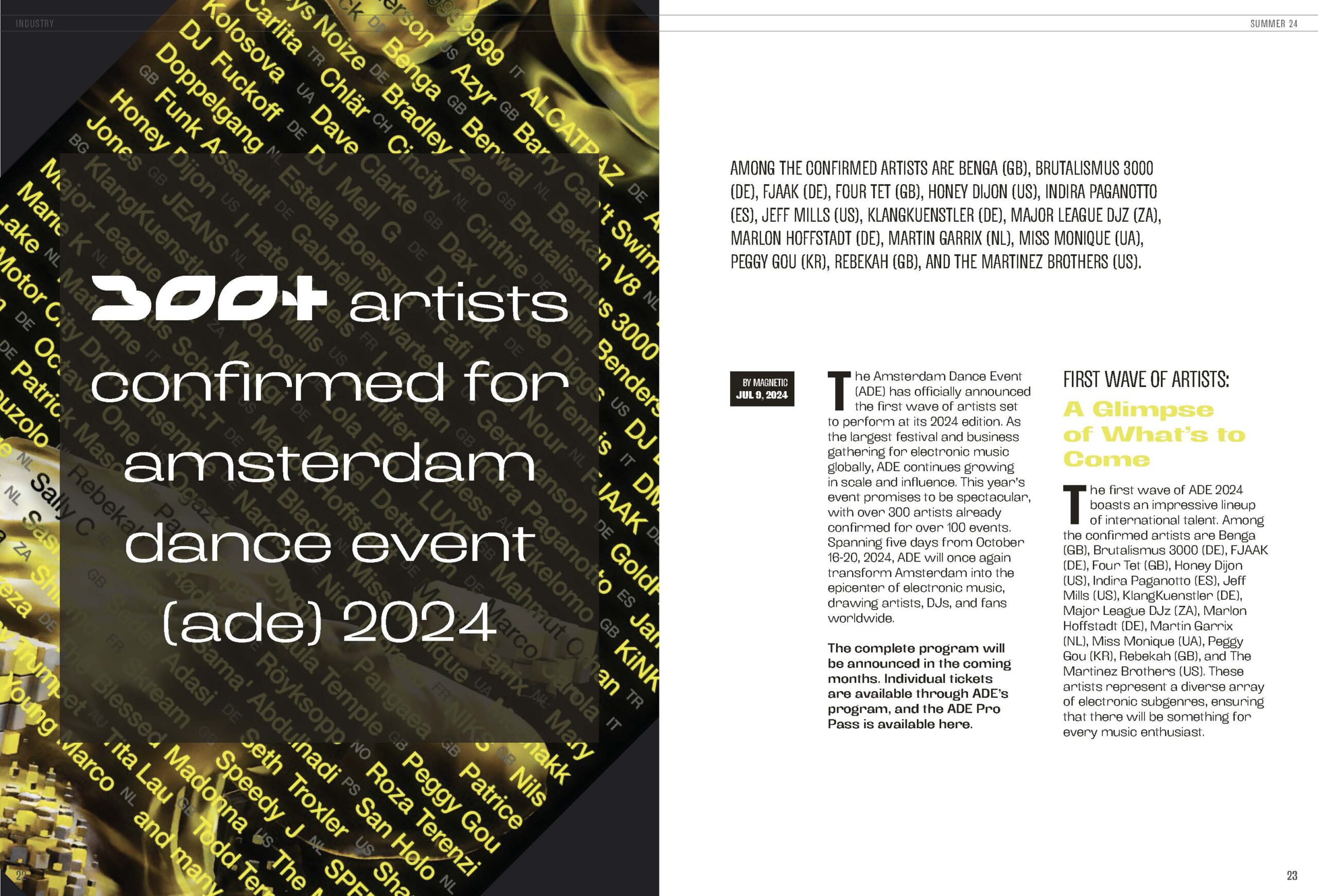
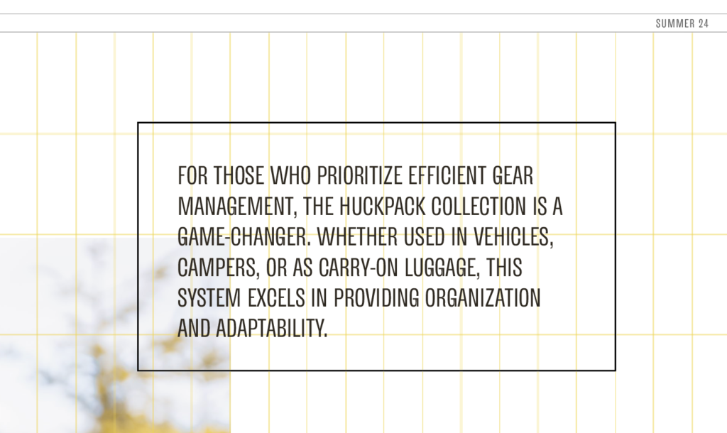
Grid
I used images of digital workstations, Ableton Live and Logic Pro X, popular among electronic music producers, as inspiration. These tools use grids to visually represent segments of time and different tracks in a piece of music.
Bevelled corners
To create a modern, geometric feel, I added a bevel to one corner on some image frames and text frames. This also mirrored the logo for Amsterdam Dance Event festival which one of the articles covered.
Connecting lines
To create flow as well as sections on the page, especially useful for the list article, I used coloured lines to connect words and other elements on the page, helping the reader’s eye to jump through the spread.
Blocks
I used block as backgrounds for some paragraphs, helping to emphasise different sections of the article.
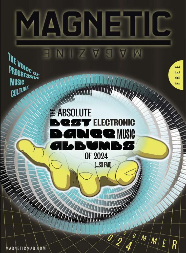
Cover illustration
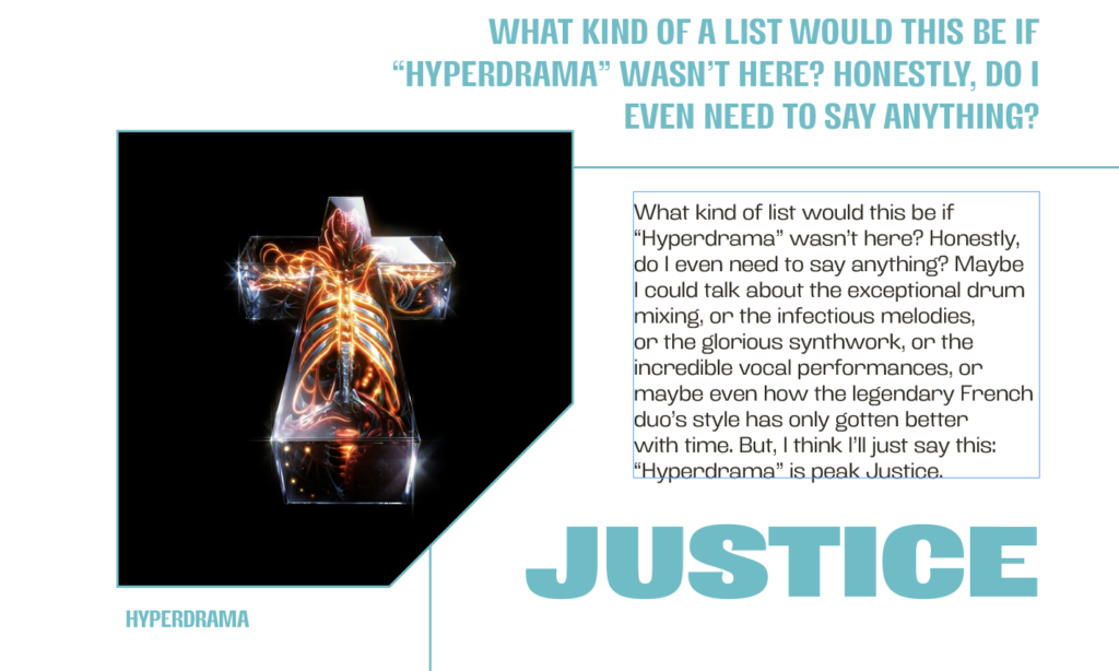
I chose The Absolute Best Electronic Dance Music Albums of 2024…So Far for my featured article since the brief specified that the product should appeal regardless of where it was being distributed and this article certainly would.
I was inspired by the music featured in the article and made a point to listen to all 12 albums. While there was a range of styles, themes included the future, technology, energy, surrealism, urbanism and loneliness.
My concept, a hand reaching out of a vortex, was intended to pull the reader in, promising a journey through music. The vortex itself and warping mesh were further nods to music production tools such as Ableton Live and Logic Pro X, as if the hand were reaching right out of the software.